JAWID ELYACY | USER EXPERIENCE DESIGN
  • Home
  • UX/Visual Design
    • Shelf Price Audit
    • PIT Inspection
    • Task Manager
    • TRMS Content Management System
    • Request for Information
    • ECHO Refund Transparency
    • Last Mile Flash Delivery
    • Mobile Wallet
    • Fast Track
    • Erica AI Assistant
    • Single Service Card Experience
    • Smart Services User Experience
    • Pet Adoption
  • Contact Me
  • About Me

Smart Services User Experience at Cisco | Lead UX Designer

CREATING A USER-CENTERED

DASHBOARD AND REPORTS

APPLICATION TO MANAGE

​PRODUCTS AND TOOLS

Overview: The Smart Services User Experience (SSUE) tool is a dashboard-style desktop application that allows for Cisco's customers to manage, view and respond to critical alerts for their Cisco tools. 

​Expertise: Enterprise Application Design | User Research | Cross-functional Collaboration

Picture

My Role

My role was UX lead on the Smart Grid tool, in which I led a small team to create wireframes and mockups by working in an iterative design manner with engineers, product managers and other UX designers among others.  I had many meetings with the stakeholders and worked with my offshore design team to make necessary updates based on changing requirements or findings from the usability studies.

The Challenge

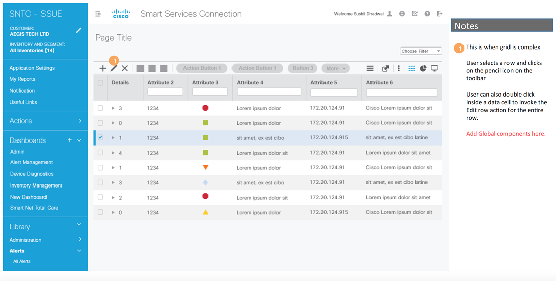
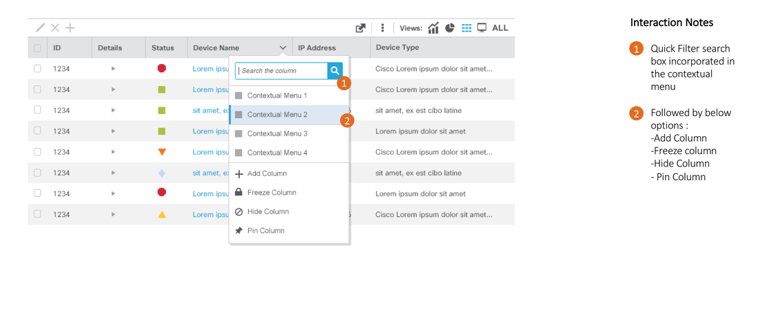
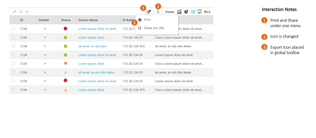
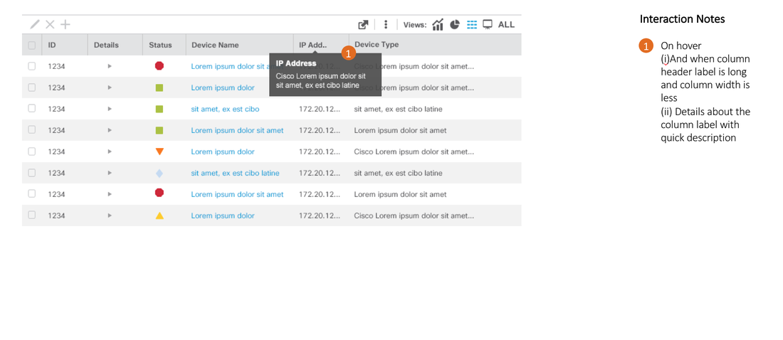
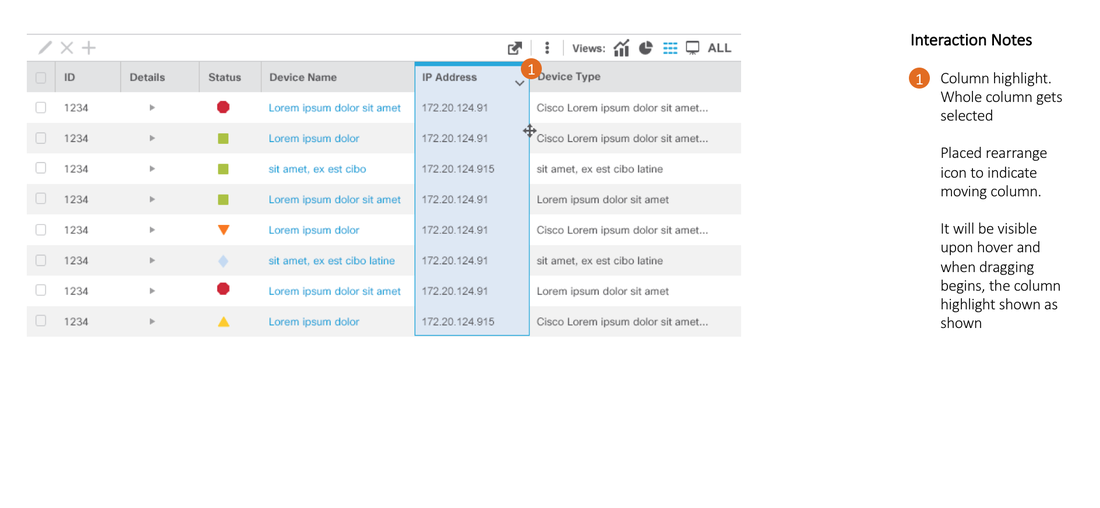
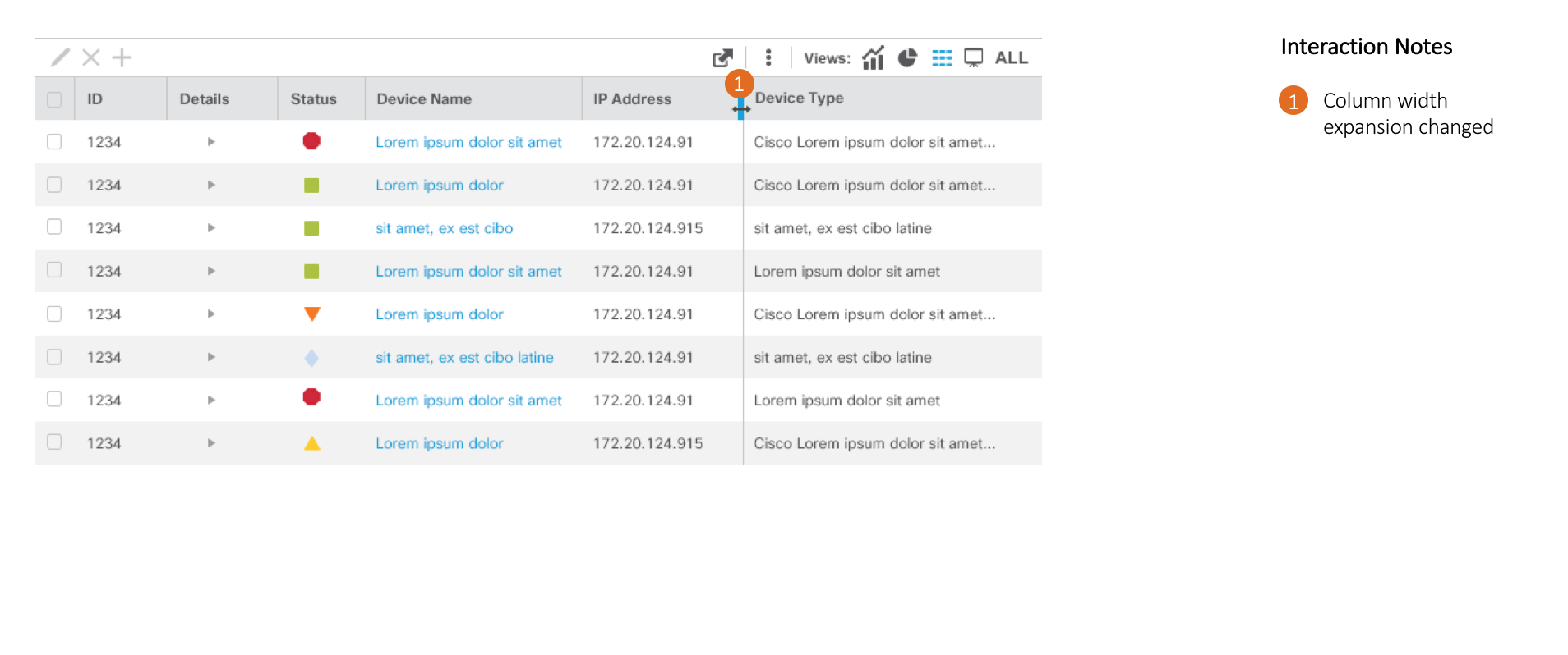
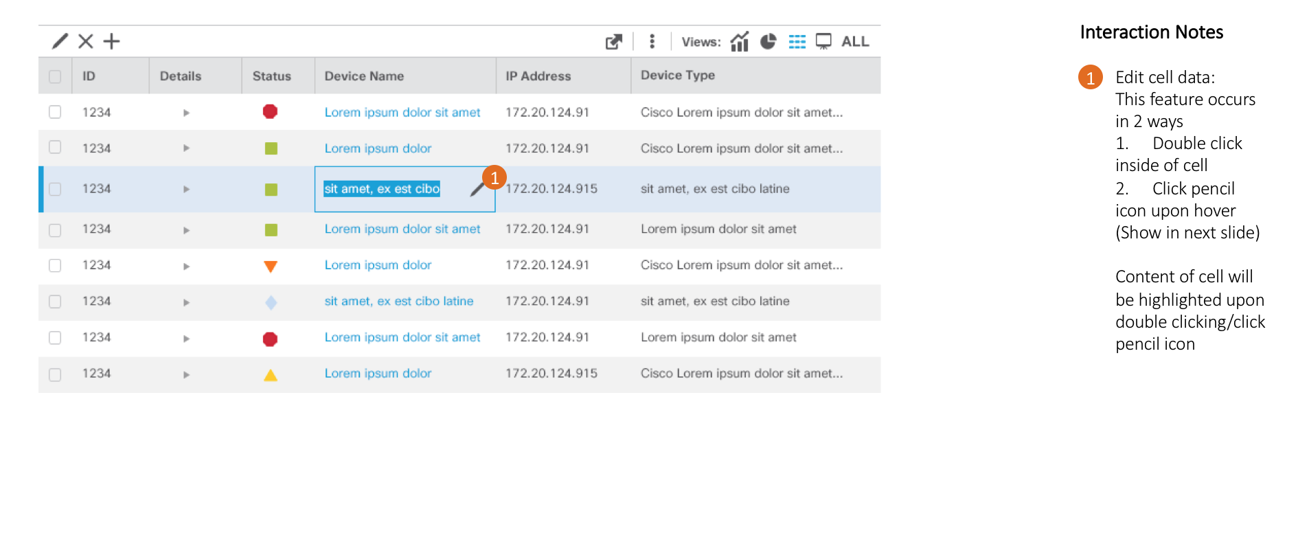
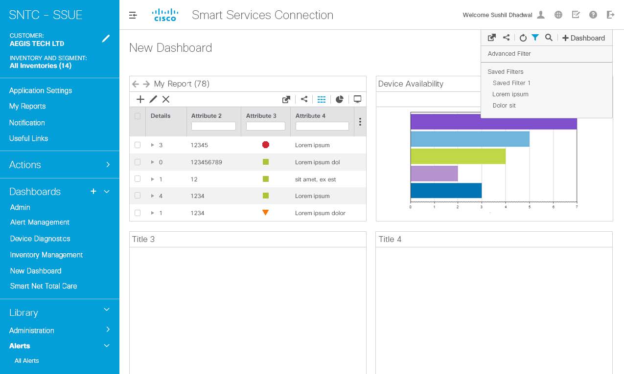
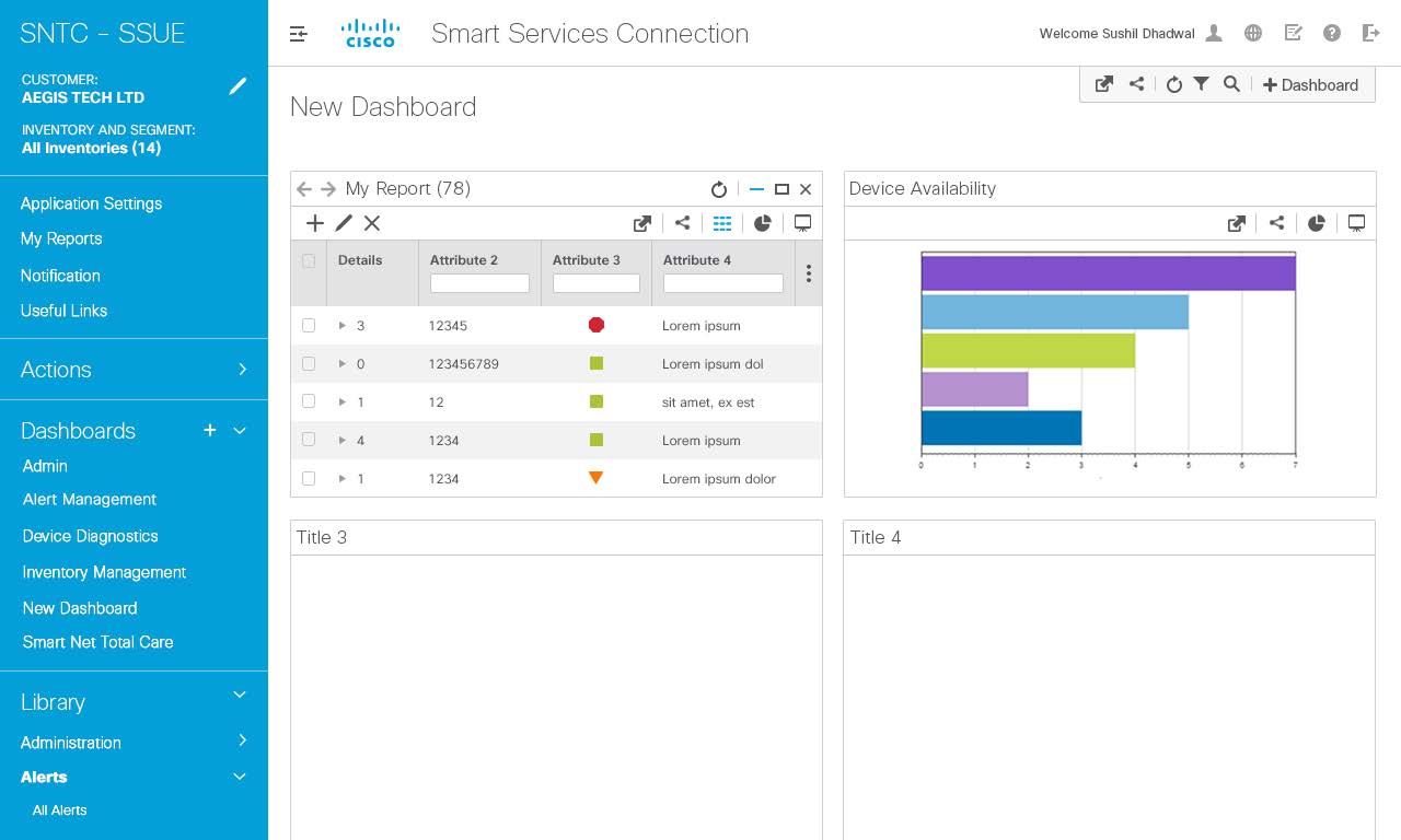
The challenge was to identify the best way to enable fast search of individual data rows thru filtering and search; differentiate clearly between global and contextual menu items on the dashboard feature and enable for effective manipulation of data rows like editing data cells, deleting and viewing child rows.

Usability Test

A qualitative informal paper prototype study was conducted on the Smart Grid application with Cisco employees.  In this study, we strive to understand how users reacted to design layout and labeling terminology as well as providing them with scenarios and asking how they would complete the scenario with the designs.

We asked participant feedback on some key screens. 
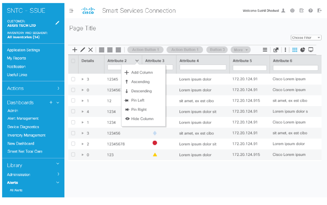
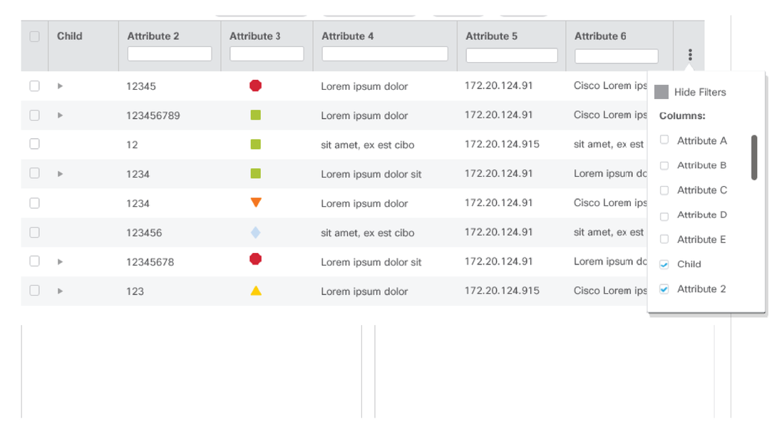
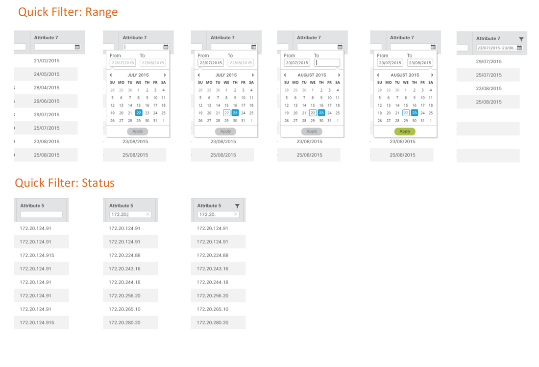
Participants liked the Quick filtering capabilities that allows them to easily narrow down the data table into consumable and manageable units.  However, they had difficulty understanding the relationship between global and contextual menu items.  They were unsure that selecting a row in the data grid meant that certain contextual menu would appear and be applicable to that row.
Picture

Initial UI Design and Wireframes

Based on the usability research, I came up with the initial set of wireframes and flows for the Smart Grid tool, mainly on the following points:
​
  • Create contextual menus for better column management.
  • Access to actions (eg. Add column, quick filter search) that are intuitive.
  • Ability to apply filters for each column easily to see only the rows deemed important.
  • Quick filters and advanced filters to streamline tool management process
Picture
Picture
Picture
Picture

Final Designs and Styleguide Specs

I designed the mockups for several key screens of the Smart Services tool. The key screens are for dashboard, which provides dashlets allowing users to view KPIs for different areas of their tool and a data grid, which allowed for detailed view of the status of their product's attributes as well as actions associated with edit, add, remove and filter/sort functionalities.
Here’s an anatomy of the data grid for the Smart Report
Here's the visual specs for the contextual menus
Picture
Dashboard
Picture
Visualization of an attribute in dashboard
Picture
Picture
Smart Report with detailed area
Picture
Mobile: Dashboard swipe
Picture
home
© COPYRIGHT Jawid Elyacy 2025 ALL RIGHTS RESERVED.
  • Home
  • UX/Visual Design
    • Shelf Price Audit
    • PIT Inspection
    • Task Manager
    • TRMS Content Management System
    • Request for Information
    • ECHO Refund Transparency
    • Last Mile Flash Delivery
    • Mobile Wallet
    • Fast Track
    • Erica AI Assistant
    • Single Service Card Experience
    • Smart Services User Experience
    • Pet Adoption
  • Contact Me
  • About Me